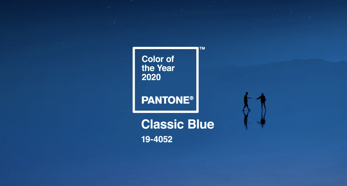
Each year, Pantone selects a Color of the Year that shapes trends across branding, design, fashion, marketing, and product development. For 2020, the Pantone Color Institute chose PANTONE 19‑4052 Classic Blue, a timeless hue defined by calmness, confidence, stability, and connection.
We explored how Classic Blue reflects the forward‑thinking mindset needed for the start of a new decade. In a world filled with uncertainty—socially, politically, and internationally—this trusted blue tone delivers familiarity, dependability, and a sense of collective grounding.
What Makes Classic Blue So Important?
Pantone describes Classic Blue as a “restful color that brings peace and tranquility to the human spirit”—a hue that promotes clarity, reflection, and resilience. These qualities resonate deeply in a rapidly changing world where people crave visual stability and emotional calm.
We agree with this sentiment, noting that Classic Blue signifies calm, confidence, dependability, and connection—all attributes that many organizations hope to reflect in their branding.
Blue also carries universal associations with nature—water, sky, and earth, making it a deeply familiar and emotionally grounding color for audiences everywhere.

Why Brands Love Classic Blue
Classic Blue appears across some of the world’s most iconic brands, including Ford, GM, Boeing, Intel, Pepsi, Facebook, American Express, and GE. The color family surrounding Classic Blue is already a staple in corporate color palettes, making the 2020 choice a natural fit for brand consistency and visual identity.
These brands rely on blue because it evokes:
- Trustworthiness
- Stability
- Professionalism
- Calmness
- Intelligence
- Strength
Classic Blue in Design, Fashion & Visual Culture
Pantone highlights that Classic Blue’s influence spans multiple industries—including fashion, beauty, interior design, branding, and digital content creation. It is admired for its:
- Versatility across materials (from soft fabrics to metallic finishes)
- Genderless, seasonless appeal
- Ability to stand alone or complement broader palettes
These traits make it an enduring anchor color that works seamlessly in both contemporary and heritage‑driven applications.
Why Classic Blue Works for Corporate Branding
By adding Classic Blue elements—or promotional products—your brand stays relevant, aligning with a widely recognized global trend. The color’s deep familiarity allows brands to:
- Modernize existing palettes
- Create a sense of trust and reliability
- Appeal to broad audiences
- Differentiate with subtle tonal variations
Even if Classic Blue doesn’t align with your core brand colors, using accent blues to give your marketing a refreshed look or emotional lift.

A Color That Reflects the Times
Pantone refers to Classic Blue as a hue that instills “calm, confidence, and connection” while anchoring us with a dependable foundation amid rapid technological and cultural change.
Its popularity across industries and global design culture shows how deeply people resonate with colors that feel honest, stable, and protective—a theme echoed across the Adobe creative community as well.
How to Bring Classic Blue into Your 2020 Branding
Ready to take advantage of this iconic hue? Consider incorporating Classic Blue into:
- Promotional products and apparel
- Retail-inspired packaging
- Event themes and gifting programs
- Branded office supplies and tech accessories
- Digital and print marketing collateral
From subtle accents to full‑color branding, Classic Blue offers an easy way to refresh your visual identity while tapping into a globally recognized design trend.
Find The Perfect New Blue Merch
Whether you’re embracing Classic Blue through your corporate palette, promotional merchandise, or creative campaigns, it remains a color that communicates confidence, calmness, and timeless sophistication. And if blue isn’t your brand’s go‑to hue—don’t worry—Pantone reveals a new color each December.
Check out our lookbooks and showrooms to start looking for your new blue branded merch.


