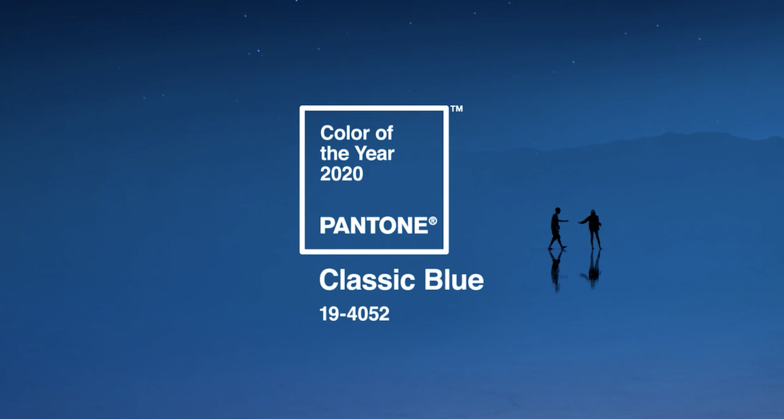
Why is the Pantone color of the year so important? – or is it even important at all? The semi-quick answer is this – you should at least be aware of the color of the year because it will be a trend influencer.

This year’s color Classic Blue, was chosen because it signifies the forward looking attitude that accompanies starting a new decade. In our ever-changing social, political and international climate, a blue like this signifies calm, confidence, dependability and connection. It’s familiar and comfortable. Its name alone recalls steadiness and it’s a color that reminds us of life – water, earth, sky.
Many of our customers are already winning with this color of the year – Classic Blue and the family surrounding it are very popular corporate colors. Think of the companies that use blue as their primary color – Ford, GM, Boeing, Intel, Pepsi, American Express, GE, Facebook. All of these companies want to evoke dependability, trustworthiness, calm and steadiness in their branding. Many others use blue as a partner or accent color. Here at Image Source, you know our primary colors – green, orange and gray. We also use a couple different blues in our approved accent colors so that we too can give different looks, spark a different feeling and create differentiation in our branding and marketing.

What are your corporate colors? Can you jump on the trend bandwagon and capitalize on some fun blue branding? If not, don’t despair, we’ll have a new color to discuss in 11 months!


